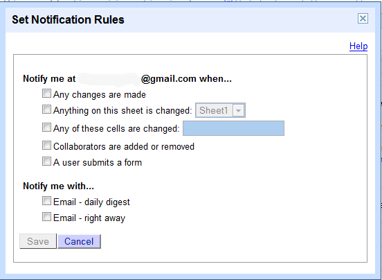
Now you can get email notifications when your collaborators make changes or edit some specific cells. You can also get notifications when someone submits new data using a form.
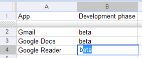
Google Spreadsheets autocompletes the value from a cell so it's much easier to enter repetitive data in a column.
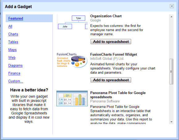
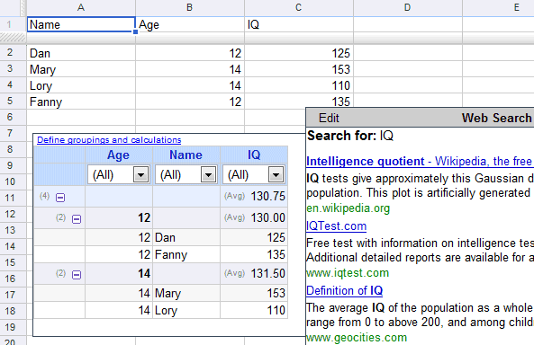
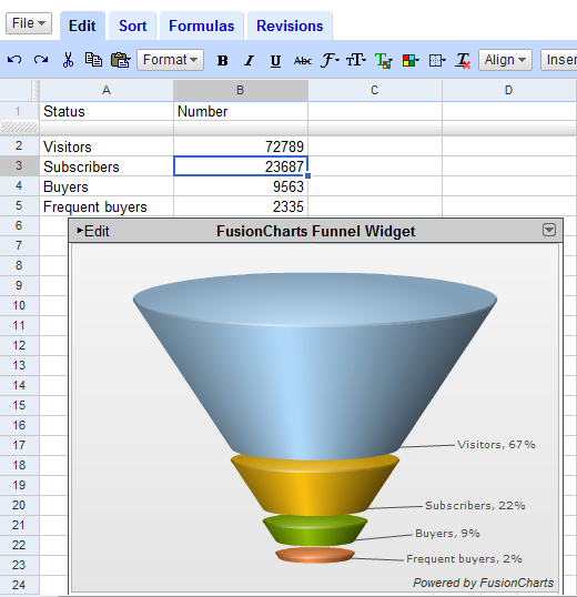
If the existing features aren't enough for you, there's a new directory of gadgets that can be added to a spreadsheets and use existing data. You may remember the data visualization gadgets I found last month: they're part of this directory, which includes many other interesting gadgets. You can add interactive time series charts, Gantt charts, funnel charts, timelines, tables with filters and grouping, pivot tables, maps, search results and you can also create your own gadget that adds other missing features. As with any beginning, not all the gadgets work very well and the pivot table gadget created by Panorama doesn't seem to work at all.
To add a gadget, click on the "Insert" dropdown and select "Gadget". Each gadget can be embedded into web pages or added to iGoogle, which is extremely cool because the data is updated automatically.
Google Docs help center mentions a new visualization API connected with the new gadgets,
If you find some interesting uses for the new gadgets, publish your spreadsheet and post a link in the comments.
{ via Blogoscoped Forum }
Update. A cool visualization gadget based on GapMinder World (you'll find in Google Docs as "motion chart"):

that is exactly what i was writing in their feedback form :D
ReplyDeleteWow - Very Cool :)
ReplyDeleteit's strange that they don't allow to group data by rows but they only group them by cols by default, or did I miss sth? Some of the gadgets are the same with the charts but they lack options the charts already have!
ReplyDeletethe Pivot works now...cool
ReplyDeleteI've added a Gauge gadget that's pulling from a live feed of our support ticket spreadsheet. Definitely an addition to the Google Sites dashboard for our support group.
ReplyDeleteThis is a brilliant new feature - especially the ability to easily build gapminder-style motion charts. Now, if only web-based interfaces didn't suck (it'd be nice to have basic things from Excel like drag-and-drop)
ReplyDeleteawesome
ReplyDeleteGoogle has outdone themselves again.
ReplyDeleteGoogle seems to be using Adobe Flex, for example for the Motion Chart Gadget ('Is It Flex?' link)
ReplyDeleteI'd like to mention another pivot table solution entering beta in the next couple weeks:
ReplyDeletewww.shouteureka.com
demo at:
www.shouteureka.com/flashdemo.html
Thanks
Thanks for the tip :)
ReplyDeleteMaybe I'm getting this wrong but how do you get to display the data "right".
I mean the total is 72729 (visitors) not the sum on all 4 rows. Therefor the percentage of frequent buyers should be [2335/727.89=]~3.2% not 2% as shown there.
Some how I can't get the Moving Booble into work. Other gadget work sometime but in general very slow.
ReplyDeleteIs there any example of real data that need to make Moving booble work. The current instruction is a bit confusing
i can't figure out how to use the gantt chart.
ReplyDeletefor the other gadgeds, there is a help... unfortunately there is none for gantt...
but after all: these features are great!:-)
i m not sure if i'll use them often, but they are really nice to look at ;)
same problem for me. there is no help for gantt charts!
ReplyDeleteThe Gantt gadget was created by a third-party: ViewPath. The format for your data should be:
ReplyDelete[Name of the task] [Start date] [Finish date]
Thanks for the heads-up! One more thing to add to the post: You now have even more color choices when coloring cells or font. They added an extra pastel/greyish row that didn't use to be there.
ReplyDeleteExcellent tool!
ReplyDeleteOne thing: it will be good if we can use logarithm scale. (but displaying correctly in the label = 0;10;100;1000....)
Viewpath Gantt Gadget sucks. Finally figured out how to make it work (by reading user posts, because they don't provide any documentation) and now today not viewing. Also you can't print the resulting chart. Or export it. Disappointing -- such a needed tool!
ReplyDeleteDoesn't work in Firefox.
ReplyDeleteThis comment has been removed by the author.
ReplyDeletecan you change the date field to months?
ReplyDeleteis there an add on for google docs that allows you to Group rows? If so, what is it?
ReplyDelete