Google even tests a slightly updated version of the old bar that uses the services from the new UI, more spacing and a different color scheme.
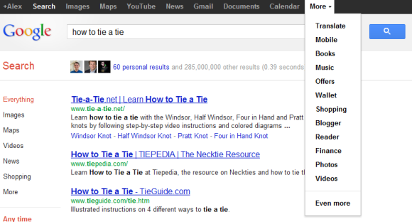
Here's how you can try the latest Google experiment. If you use Chrome, Firefox, Safari or Internet Explorer 8+, open google.com in a new tab, load:
* Chrome's JavaScript console (Ctrl+Shift+J)
* Firefox's Web Console (Ctrl+Shift+K)
* Safari's Web Inspector (how to do that?)
or
* IE's Developer Tools (press F12 and select the "console" tab)
and paste the following code:
document.cookie="PREF=ID=381502750b6e9119:U=aaee74aefea7315a:FF=0:LD=en:CR=2:TM=1328391998:LM=1328392000:S=yPtlCgLbEnezu5b4; path=/; domain=.google.com";window.location.reload();Then press Enter and close the console. If you're not in the US and you're using a different Google domain, replace ".google.com" with your domain in the code (for example: ".google.co.uk" in the UK).
If you'd like to go back to the old interface and reset the Google PREF cookie, repeat the same steps, but use the following code:
document.cookie="PREF=; path=/; domain=.google.com";window.location.reload();

All google have to do is what people have been asking for since Google had more than 5 services, the abiltiy to manually rearrange the menu bar items!
ReplyDeleteI Agree completely !!!!!
Delete+1
Delete100% agree +10
Delete+1 and add Android Market and Picasa to it, already (photos takes you to Google+ Photos if you've activated g+)
Deleteenter it...where?
ReplyDeleteEnter it in the vibes that is located in the scribes.
DeleteThat snippet doesn't seem to get me the new layout.
ReplyDeleteActually, it does on Firefox, but not Chrome 18.
Delete!!!!!!!!!!!Google Chrome 18?????????????
DeleteI can only get version 16, why?
Chrome 18 is the dev channel of Chrome, version 16 is the latest stable version.
DeleteYou realize you get what the server and the javascript say you get, not based on your browser or version.
DeleteI just wish they would make up their mind and decide on something. Anything. I hate the drop down menu, but it is even more frustrating with it changing every time I sit down at the computer. One session is the bar; the next it's the idiotic menu. Poop or get off the pot already!
ReplyDeletethere is a different between google toolbar in Firefox and chrome on the same computer.
ReplyDeleteIn chrome there is the black bar.
In firefox I am getting the new look with one big logo that have options.
I actually liked the simplified layout, but this new one looks ugly. Google, please keep the old bar rather than switching to this prototype here!
ReplyDeleteI like the grey bar much better. Sure, it could use some usability fixes, but it looks nicer. Don't like this one at all.
ReplyDeletePlus, this new one takes up even more space than the grey one.
ReplyDeleteThe simplified and unified look is far better. Sure, the drop down needs to be customizable but I'd rather see them tweak and improve that than bring back the ugly black bar.
ReplyDeleteThe only somewhat interesting feature of this is the floating profile pic on Google's classic homepage. Otherwise it's pretty redundant. Basically, keep the old black bar and follow the suggestion of the first comment. I can't believe Google hasn't delivered on that yet...
ReplyDeleteDoes it scroll? I have been asking for months to have a black SCROLL bar in Chrome like there is in G+.
ReplyDeleteThis one is so much better than the current "test" that requires at least two clicks to get anywhere.
ReplyDeleteIt still looks badly. Why you ever decided to use for dark gray? (Because Twitter uses for something similar?)
ReplyDeleteFor temporary use, till you figure out the best match, please, use the same header navigation color-plate, like
https://plus.google.com/photos/110977198681221304891/albums/5493122956711650833/5705523660431973234?authkey=CLabtrzBo87GiQE&banner=pwa
I am not a huge fan of the Google menu, but I do NOT want the black bar back.
ReplyDeleteI like the black bar and the things I can do with it. Just wish it would be a permanent fixture on the browser, and not just on Google pages.
ReplyDeleteGoogle must follow Google Search page example were thy organized all search engines in left bar. They should make the same with apps but in Google+ page. Need apps or social - go Google+, need search engines - go Google.com.
ReplyDeleteyea i saw it yesterday. but really google? how important is placing google mobile on the top of that list? it's totally the least important to be added on a list
ReplyDeletei am a bit surprised that google is working on the black bar rather than improve the simple one, and i do think items in black bar (images, video, news) are somewhat duplicated the functions on the left hand side.
ReplyDeleteJust make it customisable. I'll choose whether the bar goes along the top, or down the side, I'm quite capable of choosing size and colour, and the order of the menu items, and whether to use labels or icons or both.
ReplyDeleteJust cut a few pixels of the grey menu bar with the pull down menu, it the best one out there by far an certainly better looking than the black menu bar, even it does require and extra click.
ReplyDeleteI will be sad if and when they stop me from using it.
I like the Google-menu, but they should tweak it a bit, like shorter hover activation delay.
ReplyDeleteDoesn't Work.. Just Like the New Bar Trick didn't work!
ReplyDeleteI have a Google Apps Account!
Meh, I like the one with the drop down menu on the Google logo better. It looks cleaner that way.
ReplyDelete2nd pic looks like other new Gbar's tweak to make it slimmer: http://userscripts.org/scripts/show/119530
ReplyDeleteNo difference, huh :D
that's sucks! what is point of bolting it????
ReplyDeleteuse this script if you dont like the layout http://userscripts.org/scripts/show/116931
ReplyDeleteI liked the Black bar and hope that it will become a part of Google Chrome which I can choose to be active across all tabs and domains visited. It can replace the Bookmark bar so anyone can access all Google services easily when they are needed.
ReplyDeleteI like that Shopping was removed, I never used that link. Like a previous commentator said, I wish user could edit the bar to show only sites that we use. I use Reader, but it doesn't appear on the bar, it's in the More menu.
ReplyDeleteWorks in IE9 and Chrome (latest beta).
This is the second or third time that I've seen someone post these instructions, which claim you should open the Web Console in Firefox, but there's no place to paste the code. The proper way to do it is Shift+F4 to open the Scratch Pad (which is the equivalent of a JavaScript console), paste it in there and click Execute -> Run.
ReplyDeleteGood to give instruction on how to get the old black sandbar as well as get the combined sandbar and Google bar. But what about all of us who've gotten use to the Google bar (without also the sandbar)? Is there a way for us to get our beloved Google bar back?
ReplyDeleteGive us the damn choice!
ReplyDeleteI hope this new version is more user friendly as compared to earlier version.
ReplyDeleteLet us chose between the black bar, and the aesthetically pleasing menu please, Google.
ReplyDeleteI was extremely happy with the roll over bar. This new bar seems to make even less sense aesthetically and functionally.
ReplyDelete